Trint Live
How I turned a low engagement Beta feature into a subscription revenue stream, driving a 62% increase in Live session usage.
Project overview
Trint is an AI-powered transcription platform that helps teams turn audio into accurate, editable text for collaborative content creation. It’s trusted by journalists and media organisations worldwide, including teams at The New York Times, The Washington Post, The Financial Times, and The Associated Press.
Trint Live began as an Enterprise-only mobile feature, enabling real-time transcription during live conversations. It was later released to self-serve users as a beta to test broader perception and value.

Context
Trint Live had already proven its value for Enterprise customers, particularly journalists working in fast-paced, live environments. Based on this success, the team released a soft beta to self-serve users to test broader demand. However, the self-serve release was largely invisible in-product. Live was difficult to find, lightly explained, and lacked a clear upgrade journey.
Despite these limitations, 10% of self-serve users still tried Live, signalling strong underlying demand if usability, visibility, and monetisation were addressed.
Three pillars that helped turn this Beta into a revenue stream:
1. Improving discoverability
2. Driving usage
3. Clear upgrade paths

Exploring the problem space
Evaluating the Beta experience
Product audit
I ran user feedback sessions with Enterprise customers and conducted a product audit to identify any gaps and opportunities.
🫥 Low visibility
Trint Live was buried in the standard recording flow, requiring multiple taps to get to the Live environment. Enterprise users flagged that in high-pressure environments speed was critical for journalists to access the feature.
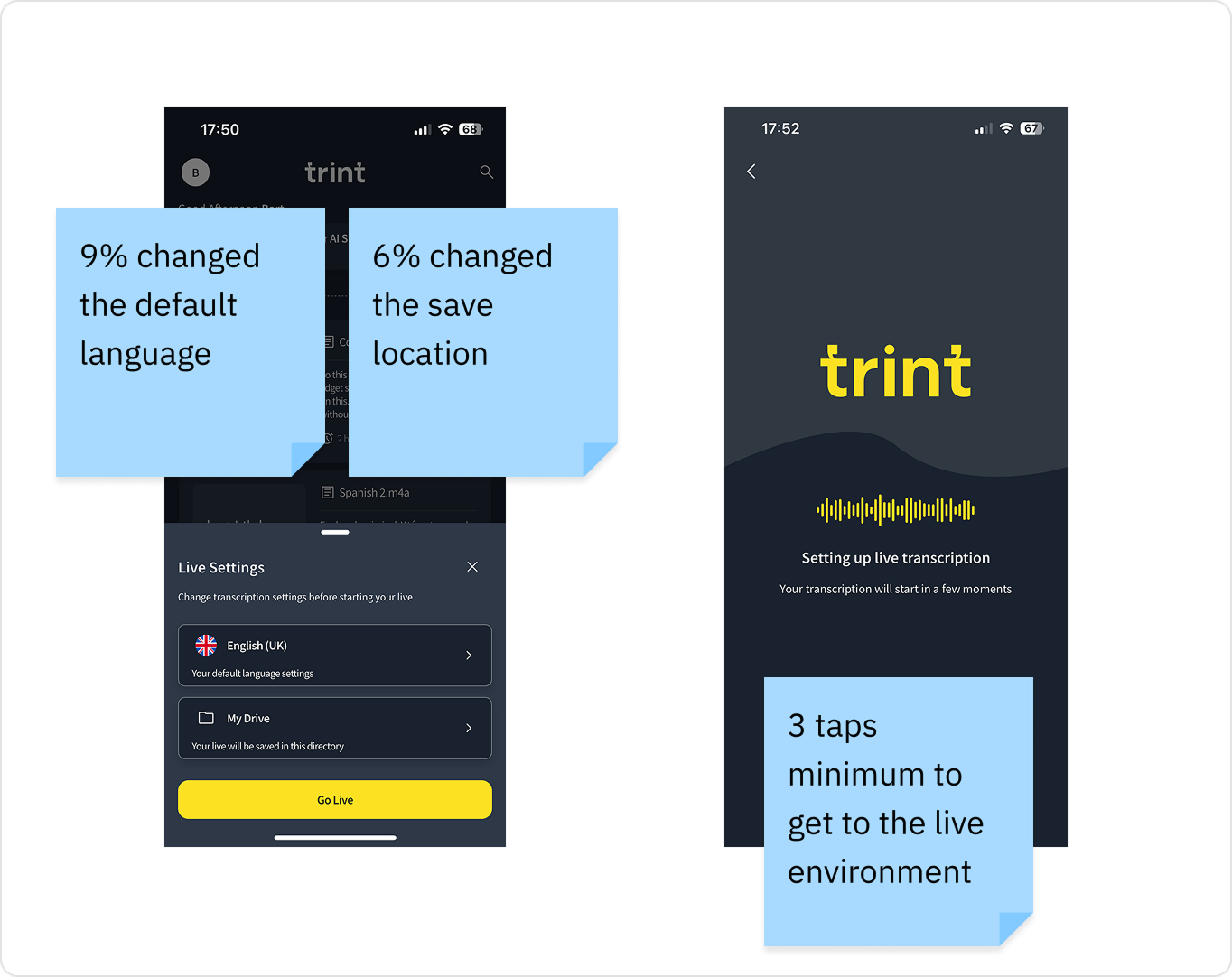
🚧 Set up Friction
Users had to pick a save location and language before recording.
Only 9% changed the default language
Only 6% changed the save location
👉 Clear opportunity to streamline the flow.
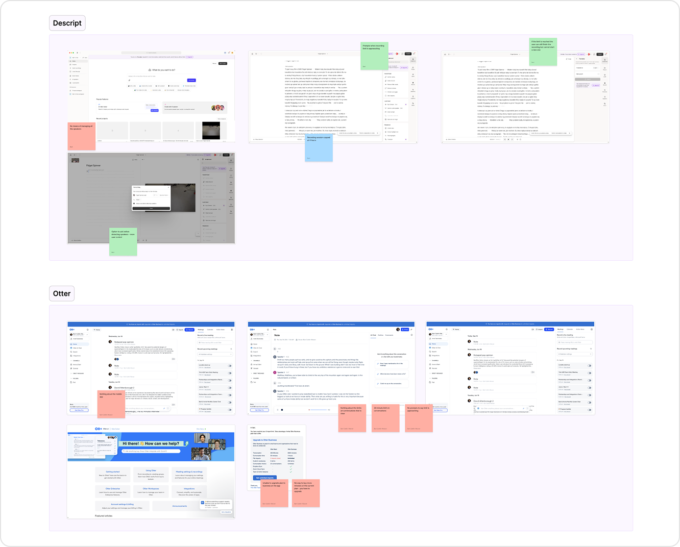
Learning how we compare to the competition
Competitive analysis
I reviewed live transcription experiences across competitor tools, focusing on how usage limits were communicated and how upgrade flows were triggered.
⚠️ Limits were often unclear
Usage info only surfaced after hitting limit.
🚫 Hard stops at limit thresholds gave a poor experience
Recordings ended abruptly with no warning.
💡 Smoother upsell path
Running over the limit should be paywalled, not blocked.
⏳ Flexible limits, hard blocks later
Let users exceed limits, but block future sessions.
The challenge
How might we help self-serve users discover and confidently use Trint Live in time-critical moments, without rebuilding the entire mobile experience?
1. Making Trint Live discoverable
Data informed design exploration
Driving discovery and adoption with what we had
I began working with the PM to explore how we might increase discovery and adoption without relying on new features or external marketing.
Looking at data, the following stood out
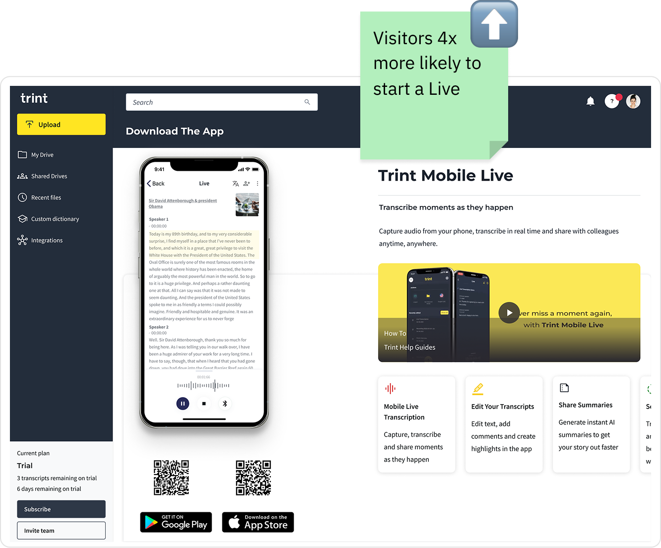
🪧 Mobile app web page
Users who visited this page were 4x more likely to start a Live session (14.44% vs. 3.55%)
Designed to promote app installs
Trint Live mentioned passively
No value props, usage guidance, or plan-based messaging
👉 Potential to maximise opportunity
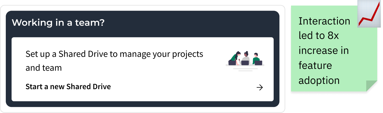
🧩 Re-using successful patterns
In a previous project I had designed a dashboard announcement card that had an 8x increase in Shared Drive creation.
An opportunity to repurpose this component to drive awareness of Trint Live.
Direct users to a space already converting into usage, with minimal lift.
Applying & improving proven patterns
🧩 Dashboard card pattern
We reused this approach to promote Trint Live, adding a card to the web dashboard that linked directly to the mobile app page, a channel already performing well for converting awareness into app downloads.
📱Mobile app page re-design
In the attempt to convert more users I redesigned the page to centre its messaging around Trint Live, highlighting its value for Journalists and teams recording and transcribing on the go.
The new design introduced stronger visual hierarchy, feature descriptions, and clear CTAs to download the app and start a Live session.
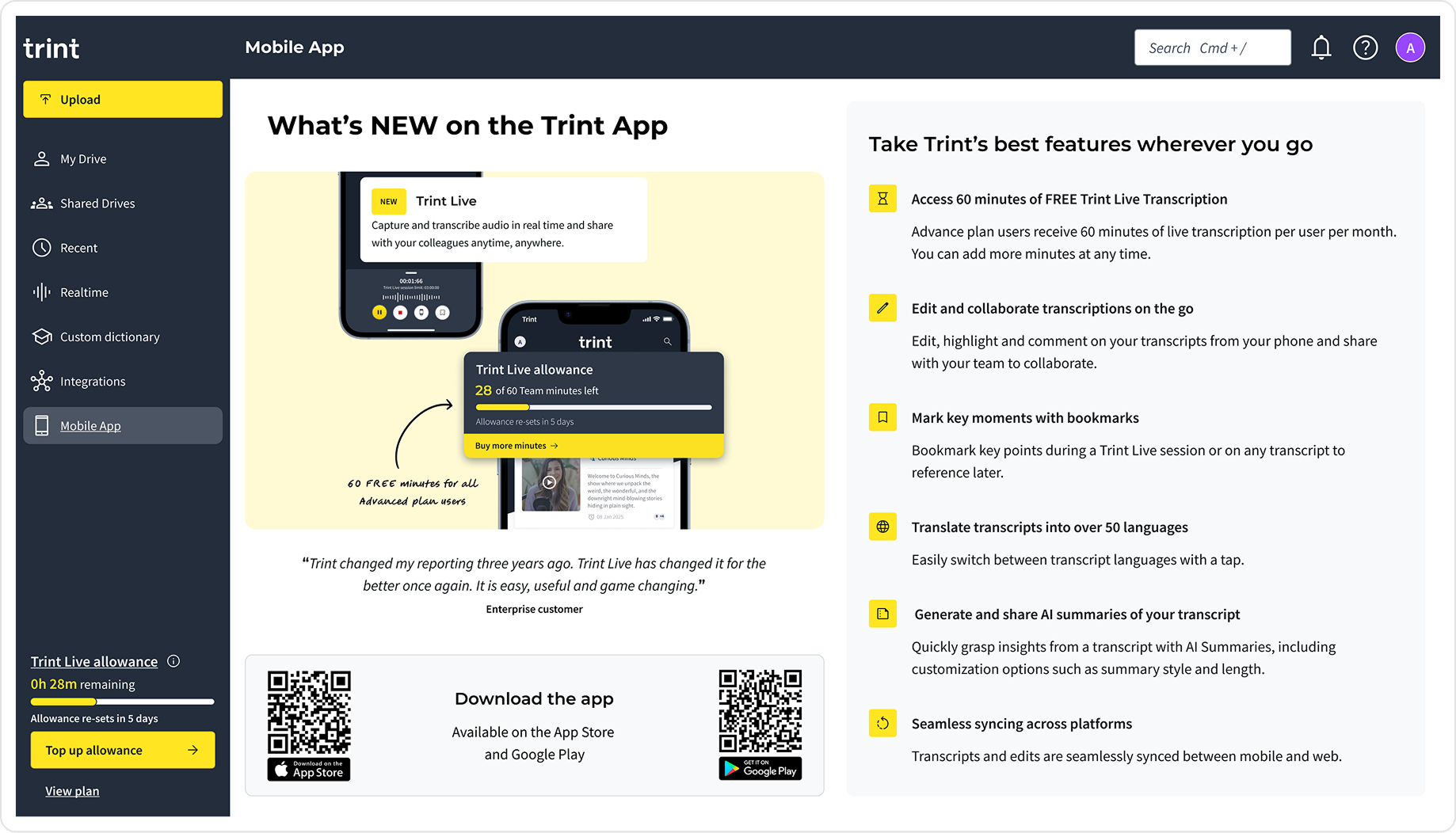
The mobile web app page served both Enterprise and self-serve users, and so variants of the page were required to reflect the plan type. Enterprise users, on unlimited plans, did not see usage limits, while self-serve users were shown remaining Live minutes and clearer prompts around upgrading.
I also prepared localised assets and layouts in advance, allowing the page to scale across regions without additional design work during development.
Behavioural lift
3.6x
Users who clicked the dashboard card were more likely to use the mobile app
+70%
Increase in mobile app page opens
2,313
Cumulative new app users over three months
2. Driving usage of Trint Live
Improving the experience around usage limits
Context
The existing Live experience relied on a hard stop when users reached their transcription limit. While this approach was technically simple, it created a jarring interruption in time-critical scenarios where users were actively recording live conversations.
Before accepting this as a given, I wanted to understand whether the experience could be improved or softened without compromising system constraints.
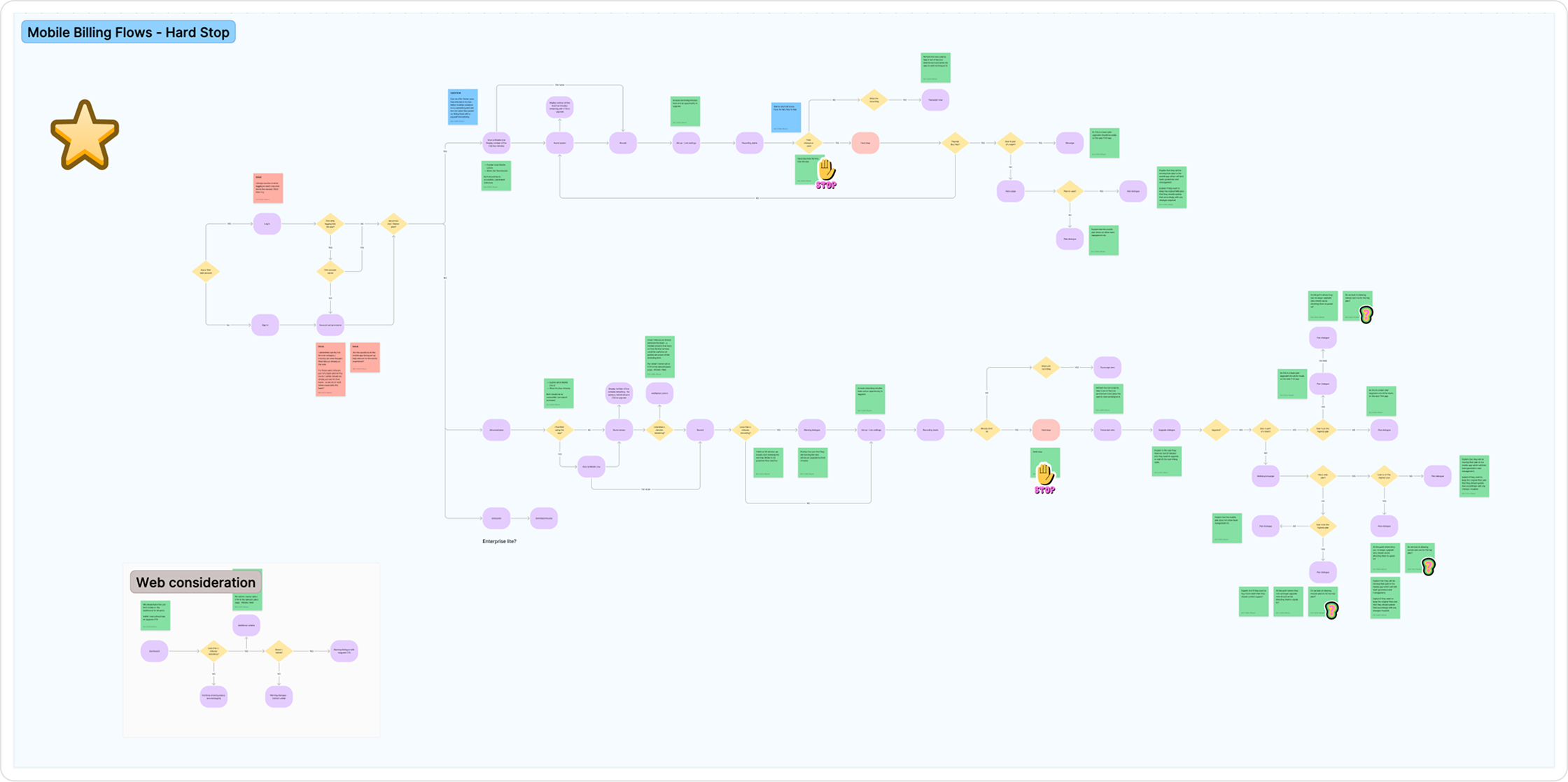
Options explored through flow diagrams
No Hard Stop
Let sessions run over. Lock extras behind a paywall. Unlock via upgrade or next cycle.
✅ Removes friction during live
⚠️ Could frustrate users who aren’t admins and can’t upgrade
Live → Standard Recording
When the limit is hit, switch to standard (non-live) mode. The session continues without interruption.
✅ Protects user content
⚠️ Technically complex stitching live + recorded transcripts
💡 Outcome: Working with a hard stop constraint
After reviewing these options with Engineering and the PM, we agreed that changing the underlying hard stop behaviour wasn’t feasible within the project timeline. The system was not designed to support excess usage without significant re-architecture.
I shifted focus to making the existing experience clearer, more predictable, and less disruptive through proactive warnings and clearer upgrade cues.
Designing with empathy & intent
Designing for emotion, not just function
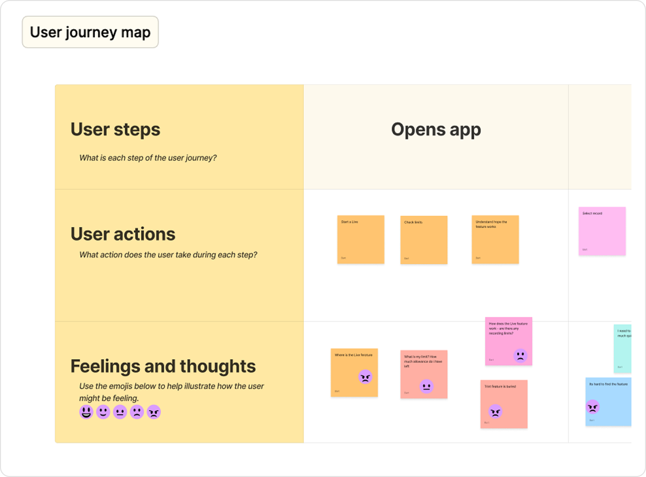
After defining the core flow, I focused on ensuring the experience wasn’t just usable, but clear and emotionally supportive during critical moments.
This work was grounded in previously run Enterprise user feedback sessions, alongside usability testing with self-serve users on the Live beta, which helped identify where users felt pressure, confusion, or uncertainty.
Using these insights, I ran an empathy workshop with my team to map the end-to-end journey to pinpoint where the experience needed clearer guidance and reassurance.
Design opportunities identified
🧭 Surface usage limits clearly
Make limits and upgrade options visible upfront.
🚀 Make Trint Live easier to access
Reduce the number of taps and give the feature more prominence to support high pressure use cases.
📣 Use supportive status messaging
Introduce contextual prompts during and after sessions.
⏳ Clear upgrade paths across devices
Compliant flows that reflect mobile and web plan restrictions
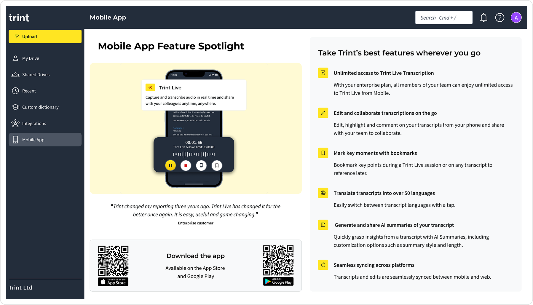
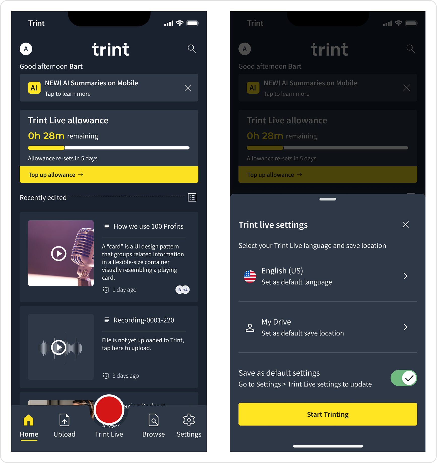
Making usage limits in-app prominent
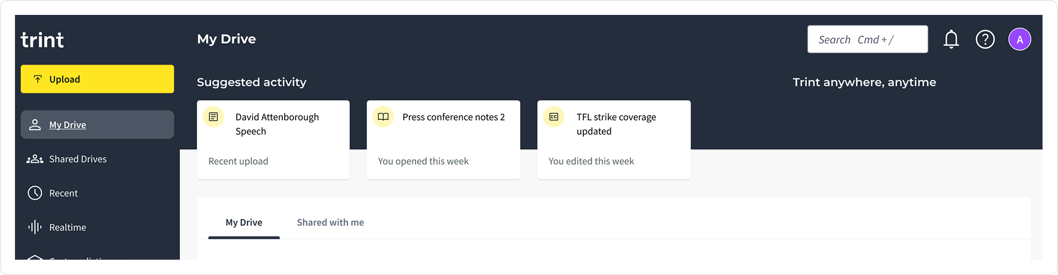
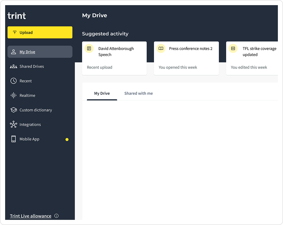
Signposting app usage limits from app dashboard
Added real-time usage tracking to the dashboard, helping users understand what they had left and how to get more.
Design iterations
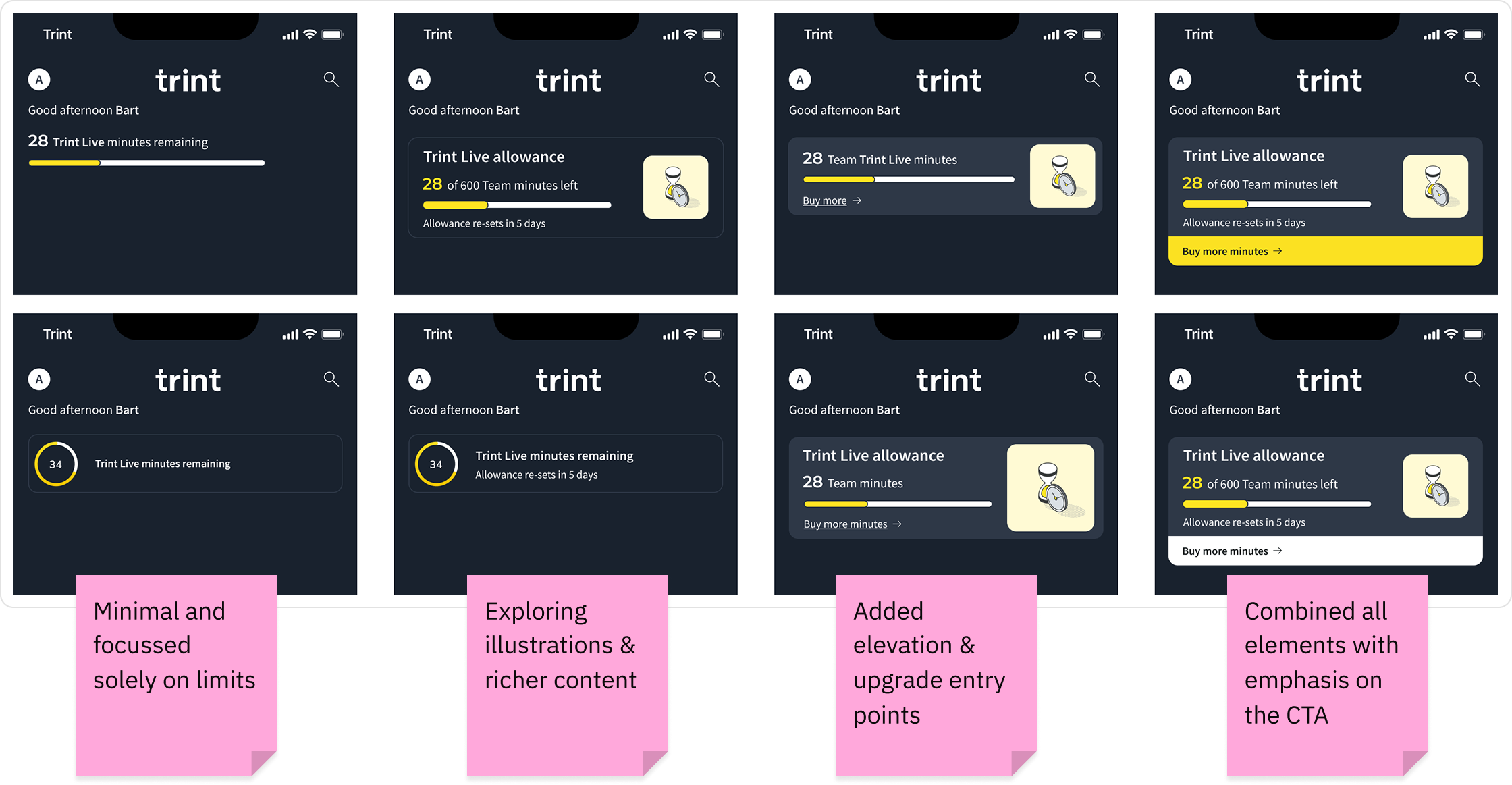
Key design considerations
👀 Visual clarity and hierarchy
Ensured remaining minutes were clear and scannable while giving appropriate visual hierarchy to additional information and upgrade CTA. User feedback suggested that the information heavy card was more informative and useful than the minimal design.
🗣️ Localisation
Illustrations were removed to give space to different copy length.
🧱 Scalability
The time format was simplified to accommodate larger team where the number could reach the 1000’s.
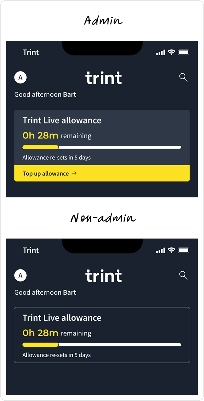
✅ Final designs
Admin view - Elevated, tappable card with clear CTA to top up and relevant usage and feature information.
Non-admin - Flat read-only design with relevant usage and feature information.
Final designs
Signposting app usage limits from the Web
🚏 Revealing untapped potential
To boost adoption, all self-serve users received 60 free minutes/month. Adding the limits on web acted as a signpost to untapped Live features, highlighting minutes they already had access to but weren’t using.
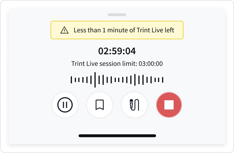
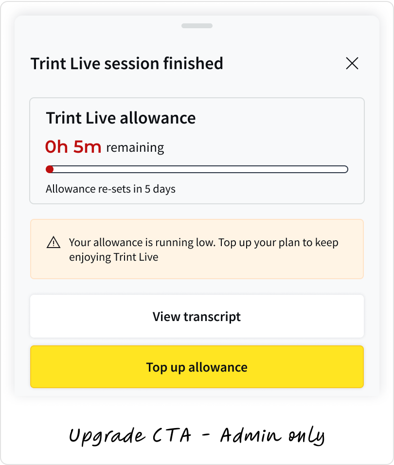
Communicating timely usage limits to users
To make usage limits clearer and encourage seamless upgrades, I introduced contextual prompts throughout the Live experience.
⏱️ In-session prompts
Informed users when they were approaching the end of their session, at 30 minutes, then at increments of 10 until there was 1 minute remaining, while displaying the maximum session length for full transparency.
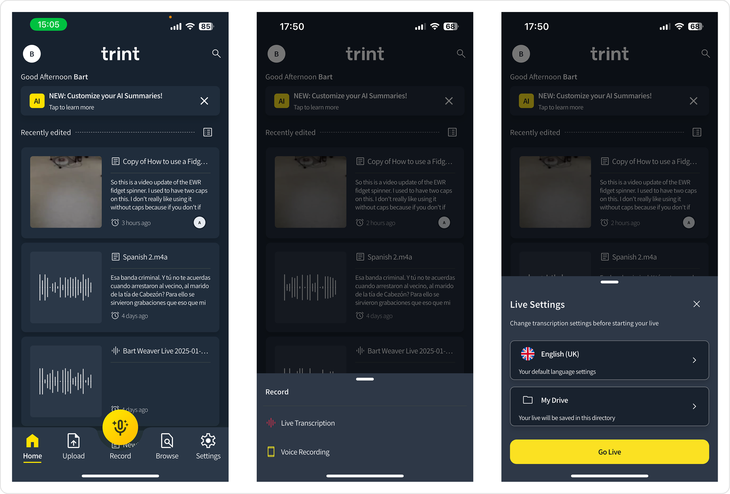
Simplifing entry points with fewer interactions
I led the flow strategy and design direction in collaboration with the PM, supporting a Junior Designer who owned the UI execution. We iterated on the flow to make starting Live quicker, while keeping recording behaviour familiar for returning users.
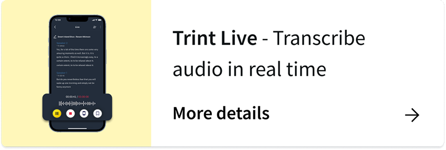
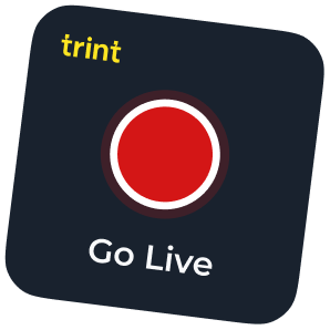
🕹 App widget
A Go Live CTA widget was created to give immediate access to the feature.
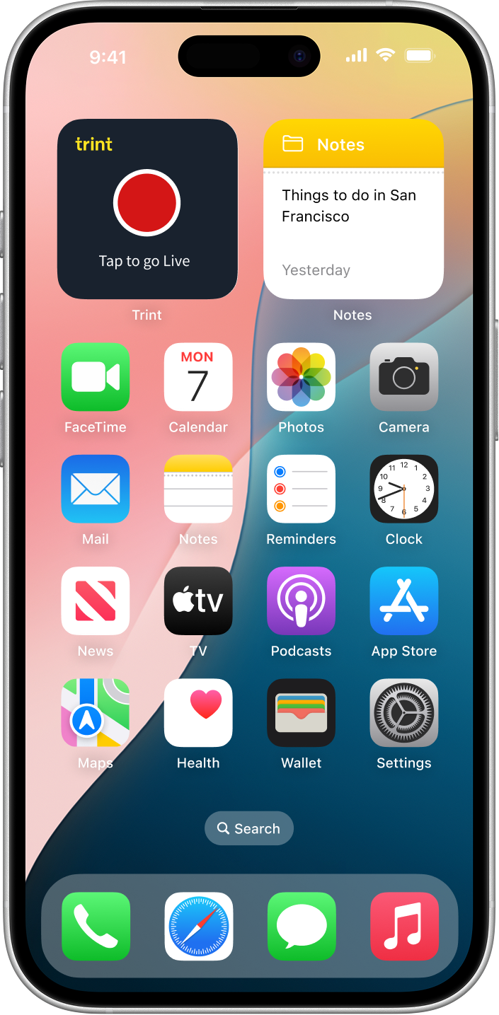
🚪 Surface entry point
Trint Live was made the primary CTA and a decision was made to relocate the offline recorder.
🔥 Optional friction
A ‘Save as default’ option included for additional settings to reduce friction for returning users.
Original experience
New experience
Following release, Enterprise clients reported that Live was noticeably faster to access in high-pressure scenarios, with several highlighting the clearer entry point and reduced setup steps as meaningful improvements to their day-to-day workflow.
Behavioural lift
+62%
Rise in Live sessions over three months
6.2 → 21.8 mins
Average Live session duration increase
Designing a clear end to end upgrade flows
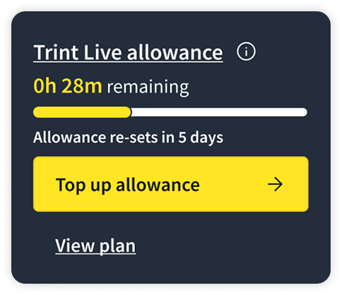
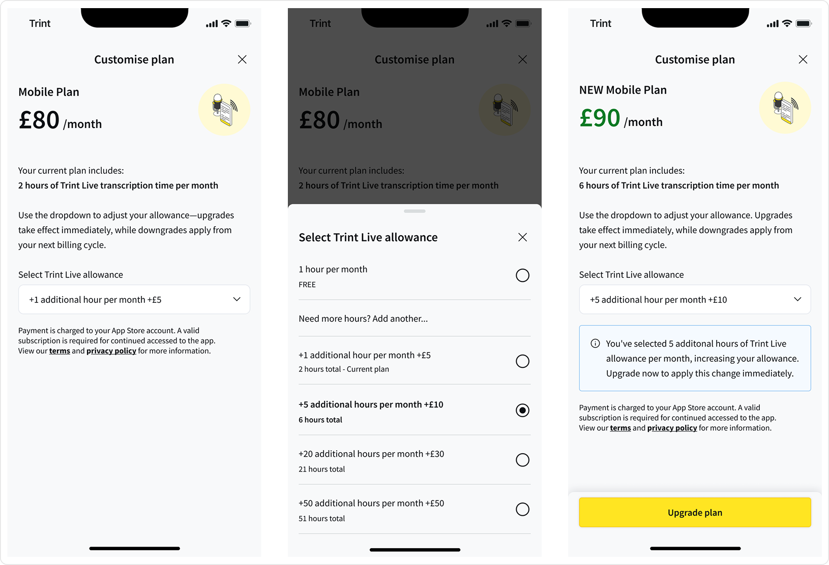
Designing multiple, contextual upgrade entry points
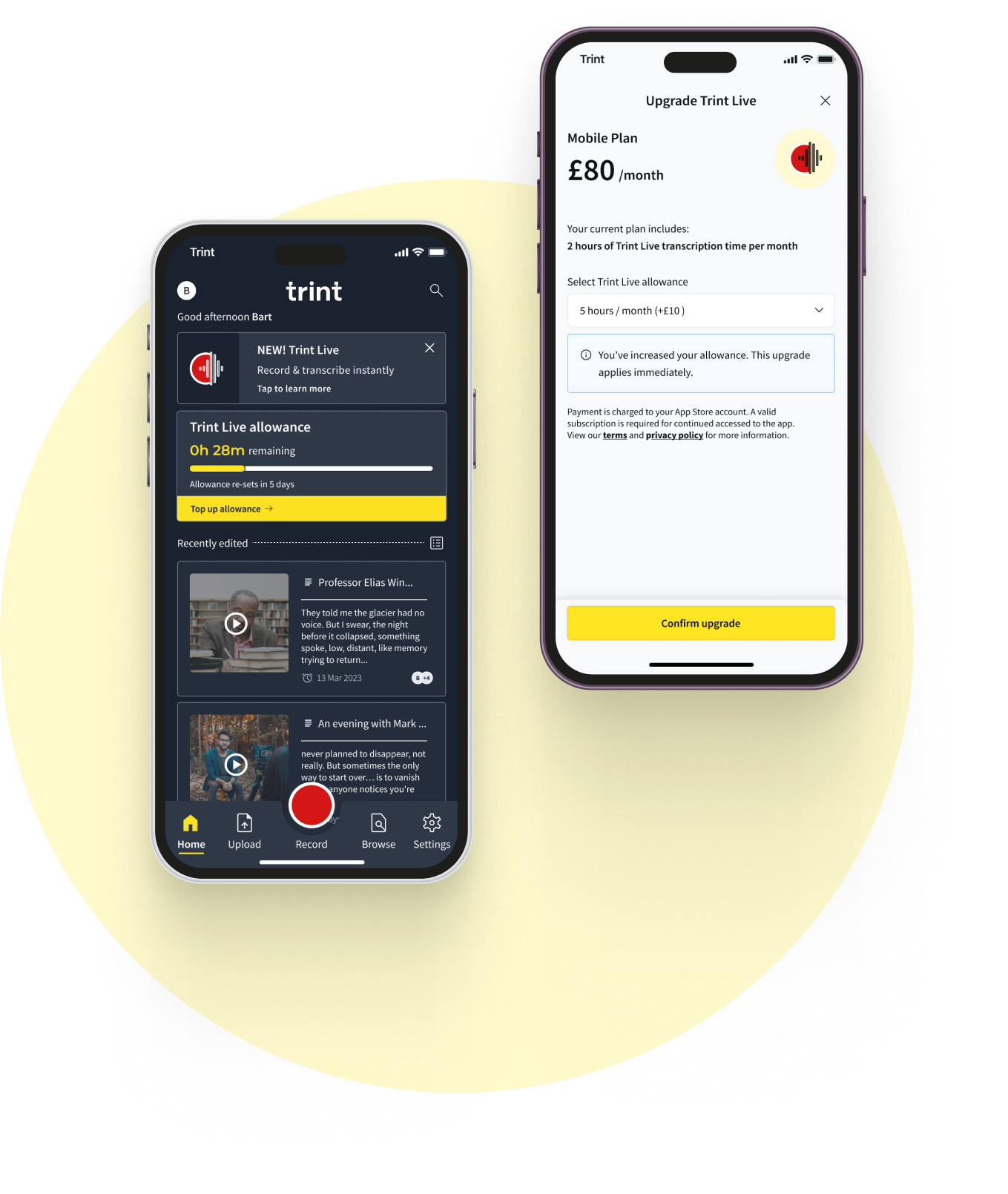
I designed multiple upgrade entry points across the Live experience, placing them at moments where upgrade intent naturally emerged, such as when users reviewed their allowance or reached usage limits. All entry points fed into a single plan customisation flow.
⏱️ Post-session drawers
If allowance fell below a threshold Admin’s were given a clear ‘Top up allowance’ CTA, while non-admins received an informative message, prompting them to speak to their admin. To reduce reliance on internal communication, I also proposed an automated email alert to notify admins when allowances ran low.
💰Upgrade
I designed a new in-app upgrade flow to clearly show how additional Live minutes affected a user’s plan.
The designs show the added allowance, updated total, and price change upfront, with clear messaging about when changes take effect. I used familiar patterns to reduce uncertainty around billing decisions.
Business outcome
£5,722 MRR
Generated by month three
Outcomes & impact re-cap
Behavioural lift
3.6x
Users who clicked the dashboard card were more likely to use the mobile app
+70%
Increase in mobile app page opens
6.2 → 21.8 mins
Average Live session duration increase
+62%
Rise in Live sessions over three months
2,313
Cumulative new app users over three months
Business outcome
£5,722 MRR
Generated by month three